loading...

Free shipping for orders above ¥50,000

Spend 250 CHF. Get a Free Beach Towel. Don’t miss out!

From Print to Living Room: The Cultural Journey of Colour

The History of Pantone and How a Colour System Quietly Shaped Modern Interiors

The History of Pantone and How a Colour System Quietly Shaped Modern Interiors

The History of Pantone and How a Colour System Quietly Shaped Modern Interiors

Textile Pieces Inspired by Global Colour Movements and Contemporary Pantone Influences

Products Used

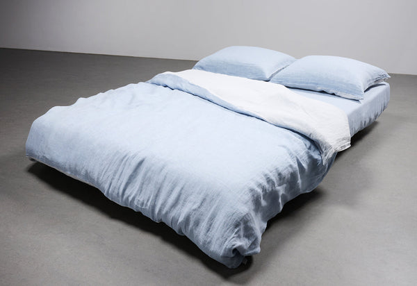
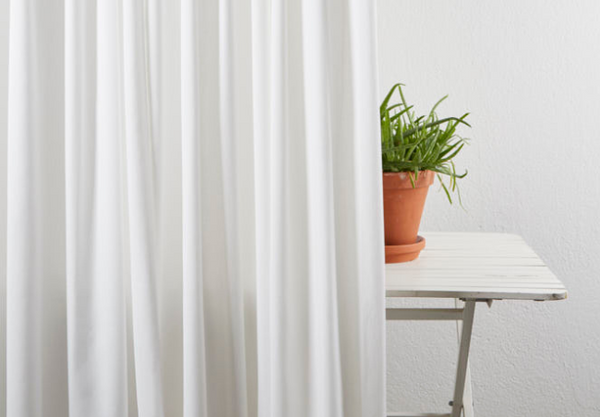
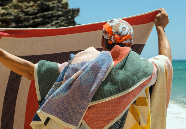
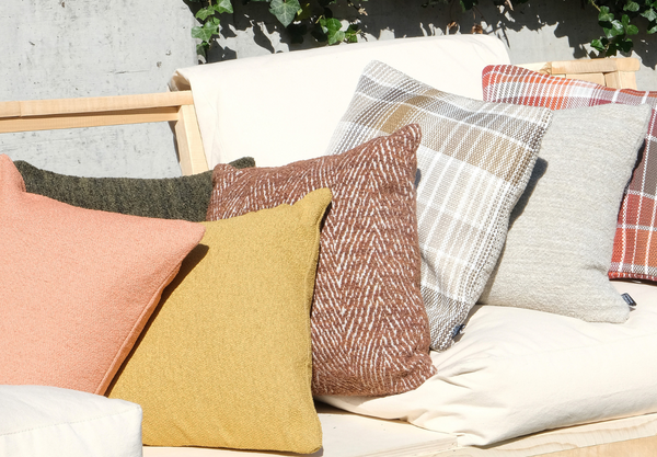
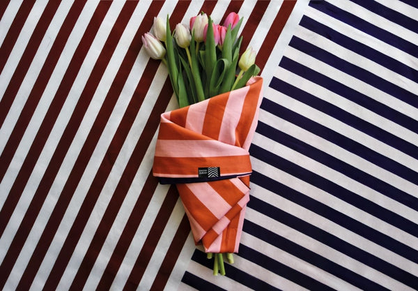
Colour forecasting may begin in studios and global trend reports, but it becomes tangible through material. In interiors, the translation of Pantone tones into woven blankets, cushions, curtains and upholstered textiles requires more than matching a shade card. Yarn selection, fibre composition and weaving technique determine how a colour lives in space.

In jacquard weaving, multiple threads interact to create depth and layered tonal effects that cannot be achieved with surface printing alone. Linen softens strong pigments and introduces an organic irregularity. Wool absorbs dye differently, producing density and warmth. Velvet and velour intensify colour, creating richness and shadow play depending on light direction.

At ZigZagZurich, colour is not applied, it is constructed. Each textile piece reflects careful calibration between Pantone-inspired palettes and the intrinsic character of natural fibres. The result is a collection that responds to global colour movements while maintaining timeless material integrity.

The History of Pantone and How a Colour System Quietly Shaped Modern Interiors

When Global Colour Forecasts Enter the Home

Pantone’s evolution from a print standard in 1963 to a cultural authority has reshaped how industries communicate colour. What began as a practical system to ensure consistency in ink production gradually became a global visual language shared across fashion, product design and interior architecture.

By the late twentieth century, paint manufacturers, textile mills and furniture brands began aligning their seasonal launches with Pantone forecasts. This marked a shift in how interiors evolved. Colour became directional rather than accidental. Homes began reflecting the same palettes seen on runways in Milan or Paris, often within a single season.

The annual Colour of the Year, introduced in 2000, further amplified this influence. Rather than dictating a rule, it offered a reflection of collective mood. In interiors, these tones rarely dominate entire rooms. Instead, they appear in accent textiles, statement throws, decorative cushions and curated curtain selections. Through textiles, colour becomes flexible and adaptable, allowing interiors to evolve without complete transformation.

The Dialogue Between Fashion, Material and Interior Expression

The relationship between fashion and interior design has never been more interconnected. Runway palettes frequently transition into home décor within six to twelve months, creating a fluid exchange between personal style and spatial design. Bouclé textures migrated from couture into sofas and armchairs. Earthy ceramic pigments inspired washed linen bedding. Bold colour blocking resurfaced in both apparel and contemporary interiors.

Textiles act as the bridge in this dialogue. A cobalt jacquard blanket, a clay-toned linen curtain or a mineral green wool cushion reflects not only seasonal colour shifts but also emotional atmosphere. Colour psychology plays a subtle yet powerful role. Soft peach and cream tones suggest comfort and reassurance. Forest greens evoke grounding stability. Deep ultramarines communicate confidence and modernity.

Material interpretation transforms these shades. Matte linen diffuses intensity. Brushed velour deepens saturation. Wool enhances warmth and density. In woven fabrics, colour is embedded within structure, creating nuance rather than flat uniformity. This layered construction ensures that even trend-driven hues gain longevity through craftsmanship and material depth.

The Dialogue Between Fashion, Material and Interior Expression
ZigZagZurich

ZigZagZurich

Artists. Meet. Textiles.

Explore artist

FROM THIS ARTIST / ZZ RECOMMENDATIONS

The History of Pantone and How a Colour System Quietly Shaped Modern Interiors The History of Pantone and How a Colour System Quietly Shaped Modern Interiors
YOUR CART IS EMPTY