










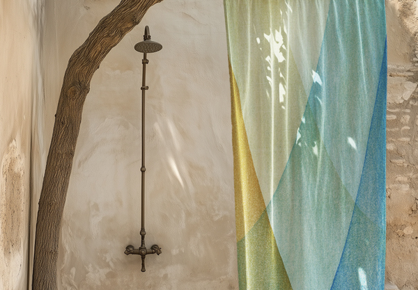





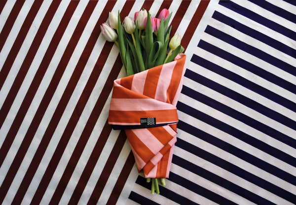


Striped wallpaper changes how the eye travels through a room. Fine lines create a steady background rhythm, while wider bands and abrupt colour shifts make the wall feel more architectural. Begin with the atmosphere you want, then compare the design with the floor, timber, stone, upholstery and the direction of natural light.
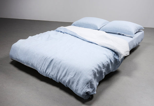
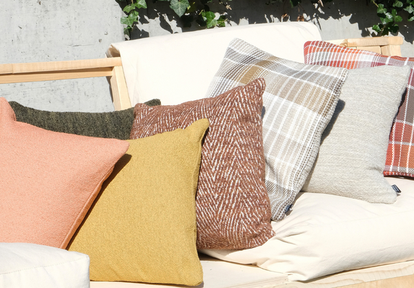
Pale blue, lilac, grey and soft green can keep a bedroom or study calm. Ochre, burgundy and earth tones bring warmth to living and dining spaces. Brighter combinations work well where the wall should become the room's visual anchor rather than disappear behind furniture.
- Use closely related tones for a quieter, more continuous surface.
- Choose changing widths and dark interruptions for stronger graphic movement.
- View the sample vertically in daylight and after the lamps are switched on.
For a softer palette, compare Stripe Tease 43. For a more energetic composition, look at Stripe Tease 23, then compare every colourway in the Stripe Tease collection.


